Usability Woes
2007/09/10
Occasionally when I venture out from my lair on the moon, I see such appalling sites that I must point them out. I’m not talking about current gas prices (nyuk nyuk); I’m talking about usability errors! Errors in design and/or construction of something that makes it much harder to use than it should be.
So instead of annoying whoever I’m with when I’m out and about, I will annoy you, Internet!
Here is a batch of things I saw on my trip to Virginia/Maryland/DC. Sorry for the cameraphone quality.
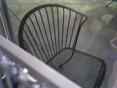
I really had a problem with this chair. If you notice, the arm rest has an interesting corner on the end of it. This piece is located in the physiologically IDEAL PLACE TO INDUCE SEVERE PAIN IN WHOEVER SITS IN IT. How? By stimulating the not-so-humorously named funny bone. It is neither a bone nor is it funny.This sadistic excuse for a buttocks support structure gave me at least 3 shocks to the ulnar nerve during that 45 minute dinner. So in usability terms, it fails the Not Supposed To Hurt People Who Use It test.
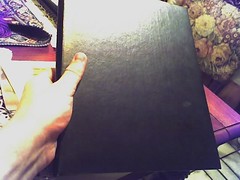
Now this hot little ticket is a menu from an oh-god-this-is-delicious restaurant in Washington, DC. Now I get that you’re fancy and Italian, but usability always comes before aesthetic! I couldn’t even tell which way was right side up or upside down. And on the back…
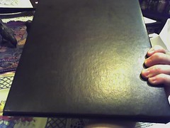
More of the same! Gah! I don’t like feeling dumb when I open my menu upside down and backwards.
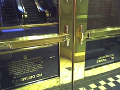
So this door is basically the model for usable doors. It indicates that one must push the door, near the seam of the two doors, to open it. It is hard to construe it any other way. Now, the other side of the door is another story…
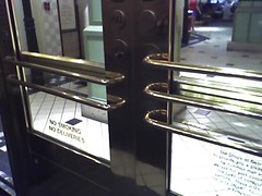
OK, first thing: one door has 2 bars, the other has 3 bars. This is baffling enough in itself, but what’s more baffling is that THESE DOORS MUST BE PULLED. Why would you put a series of bars to indicate that a door should pulled towards oneself?! While standing around, I saw a woman crash into the door then struggle with it for a bit before finally realizing that OH, RIGHT, I HAVE TO PULL ON THE PUSH BARS. Gah.
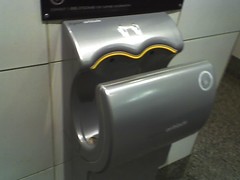
Now here’s an example of good design. This is called the Airblade, and it’s used to dry your hands with air. People get a little wary when they don’t see their normal dryer, but this is pretty simple. You stick your hands in, then slowly draw them out as a jet of air dries your hands! You don’t have to touch it, making it much more sanitary than normal hand dryers, AND it’s much more efficient being motion activated and using a thin blade of air. Love these things.
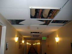
Finally, here is an open source ceiling in the hotel I stayed at. Very usable!