Problems with Microsoft Office 2007 Beta's Website
2006/05/30
I decided to take the leap of faith and trust Microsoft in their next generation operating system efforts by becoming a beta tester of Microsoft Office 2007. I go to Microsoft's home page to try to download it. Well since I want to download something, this seems like a good place to look.

So far so good. Hey look, there's even a pretty big link that catches my attention to get the beta of Microsoft Office 2007.

Click through to that and there's an adequately helpful download button.
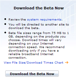
Cool, just click this to download, right?

Wrong. I have a few problems with this page. First, are two headings really necessary? I mean, all you need to say is "Download 2007 Microsoft Office System Beta 2" once. Not only do they say it twice, but they also de-capitalize the word "system" in the second heading. Knit-picking? Yes. Nonetheless, this is branding 101, amateur stuff. I'm not sure how choosing my country will help "complete your [my] download," either. Regardless, I play the game, choosing United States.
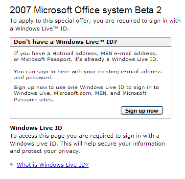
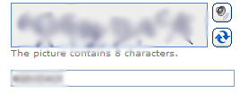
What is this? I need a crappy email address? Proprietary much? I am forced to make this email address that I will never use again. Spam is too good a fate for this email address. For statistic's sake, I will count how many forms I had to fill out throughout the entire process; so far it's been 6, one being a relatively difficult CAPTCHA, though they did have a refresh button and audio support.
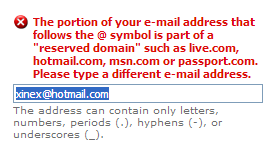
Ok, good, right? Nope. I get this message because apparently this is supposed to be some random domain name instead. Uh... what?
I should definitely be able to download it now... @#$^!

Now I have to fill out a survey? This is getting really frustrating. Required fields filled out tally: 12. After all this hassle, there better be no more forms.
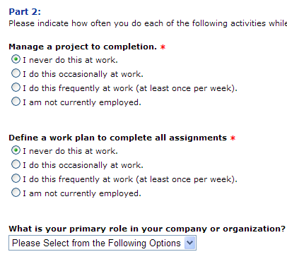
...15 required fields.

Now I have to verify my email address? Didn't I just create and sign in with an account to do that?

Verify my email address and select my language again?! Finally, I get to the screen with the download link and click it to download an .exe file.
Let's count again: 17 required fields to fill out, roughly 12 different screens to wade through, many with the same information, and a huge download that takes about a half hour on a fast connection.
I hope Microsoft doesn't use the same repetitive process for buying their products online, or they've lost me as a customer.