Part 1: The (Accidental) Design
2008/04/18
This is a series of posts I did about the redesign I did for the CSSReboot, a yearly project to refresh stale website designs. It was about the design pictured below.
Welcome to my May 1 CSS Reboot! First and foremost I suggest checking out all the other designs out at the CSS Reboot. There were a ton of problems but it is finally up.
I've decided that I have too much to say about the design and what I've learned in one post, so I will split this into a series of articles spanning the week. Today's post will be about how the design came to be. There is not much I can actually say about designing this site, except for a few notables.
The Prossess: Exploration and Discovery
The foundation of this design was based on plain old exploration. I was bored one saturday night, not feeling particularly creative. A blank white canvas stared at me while I stared blankly back. I made a shape: a rounded rectangle. It was a start. I then moved the rectangle all over the canvas, copied it, made other rounded rectangles with different heights and experimented with colors. I just did what felt right, and even did some things that didn't feel right. I explored.
For me, exploration is the most essential part of design. When I fired up Photoshop, I wasn't planning on making a new design for my site. I was clearly just messing around. But with a little experimentation, I found something that could work.
In fact, all of the design was based off the realization that the banner and a few specific colors worked well together. Exploration gave me a strong starting point to work from. It also kept me going as I discovered new ways of doing things and new aspects of design.
Of course, with as much time as I had to develop the design, it should be great, maybe even better than it is. This process doesn't work for everyone as D. Keith Robinson comments on here. For this particular design, however, things just seemed to click.
Accidental Design
I will be completely honest: I am not an artistic person by nature. I just can't do it. That is why exploring and stumbling upon this design brings me such pleasure. I like to call this round-a-bout way of designing accidental design for obvious reasons.
Of course, it could be argued that all design is accidental in some sense of the word, but I tend to disagree. There is a substantial difference between carefully planning a design and just stabbing a marker (or mouse) onto a piece of paper (or Photoshop canvas) to see what happens.
Accidental design took two major forms throughout the process. The first, as mentioned above, was the banner upon which the entire site was based. All I did was experiment with colors and elements until it looked adequate. The second aspect of the design which was much more accidental than the banner was the diamonds.
As I went through the process of choosing a font for the logo, I stumbled upon a font which I have often mocked in the past because of its apparent lack of use: Wingdings. Was I ever wrong. I was literally arrowing down the list of fonts in Photoshop when I arrived at Windings. The character for an uppercase "G" was somewhat interesting, enough so that I decided to explore the font a bit more. I tested the alphabet until I came upon the lowercase "w", a quadruple diamond shape. I was really impressed by this character and found a place for it.
That's right, I accidentally found a major cornerstone of what was to be this design. I knew that the design, at that point, was to say the least, a little bland. Besides the banner, there was nothing to entice and hook the reader. The diamond theme was just what I was looking for. They are unique in that I don't think I've seen any other design utilizing diamonds. With a solid foundation, I slowly built upon the theme, adding different types of diamonds in places that needed something.
The diamonds just made the design that much nicer. I appreciate all the little things a designer does, which is why I enjoy designs like Veerle's so much. Not only is the first impression stunning, but it manages to keep on impressing you as you explore the site. The ticket stubs in Veerle's design particularly stand out. With the diamonds that I accidently discovered, I hoped to add depth and detail to a design that seriously needed it. Did it work?
I hereby proclaim this design Banned.
Good-bye, Huge Logo Design. We hardly knew ye.
Part 2: Information Architecture Theory
Information architecture, or the design of information, is an essential part of any design. Indeed, even in print design or menu design, this is one of the most important aspects. Think about all the Mom and Pop restaurants menus you see. They are not usually very sexy, but they get the job done well.
In my experience, Information Architecture is the most overlooked facet of any design. It is most often overshadowed by some of the more interesting visual elements. When is the last time you gawked at a fancy header? Now compare that to the last time you gawked at how the information on a page was displayed. Was it never?
If so, it is a trap that many people fall into. For good reason, too. It's not particularly captivating to discuss how Information should be layed out. However, it is necessary to think about it. Without this, most designs would be utterly useless, even if they are visually pleasing.
There is spectacular quote by Joshua Davis in his interview with Digital-Web. When asked what beauty in design is he responded:
Being able to justify every pixel.
This really should be any web designer's goal. Sure a site should be visually pleasing, but it's the things that users don't notice that make the site truly great. To quote an old saying, "It's the little things that count."
The Applications
The way I'm talking, it sounds like no one puts any value at all into Information Architecture. This is obviously not true, and I'd like to prove it by using an example from the wild.
Jon Snook's site. It starts with the simple navigation on the left. The actual content is clearly separated and placed in spot the eye naturally drifts to. I especially like how the introduction to the site is handled. There is a very short description using a few keywords in the logo followed by a section that acts as a good starting point for new visitors. Then the posts are clearly labeled and separated from one another. I could go on and on about each minute detail, but there is one that stands out as an excellent example of information design.

Jon's Floating Form (it can be witnessed on any of his newer posts) is usable and helpful. Snook noticed a problem and decided to fix it.
The reason why I like this idea is I've often found myself responding to an article or to another comment and having to scroll back and forth to formulate my response. By having the comment box available in this fashion, I'm hoping that I've made it easier for people to post comments on the site.
He wanted to make the process of commenting easier to, I'm sure, help foster a community so he made a key piece of functionality immediately apparent. At one point, he had to make a conscious decision to design around the form. This in turn leads to a question that must be taken into account with information design: Is an element relevant and important enough to consider adding to a design? Overall, his site is a very fine example of Information Architecture at work. Bravo, Jon. Update: Turns out Mr. Snook is rebooting his site and will most likely make some major changes to the design, but still the ideas are still sound. (I wrote this series last week.)
Of course, there are hundreds of other sites that are prime examples of good use of information in the right places. Over the next few months I'll be taking a look at some of the ones I think are the best.
A website is supposed to be tailored to the user's needs. Information Architecture goes hand-in-hand with giving the user what he or she needs. It makes the site easier to use. To figure out how to do that, one needs to ask questions, find and fix problems, and most imporantly of all, research.
Useit just posted some interesting results from a recent study. The study's purpose was to see how people viewed/read a website. It concluded that general user's eyes naturally read the site in an "F"-shaped pattern. This shows how a bit of research can be used to make websites better.
Of course, all sites and users have different wants and needs and must be accomodated in some way. For my site, I considered what I wanted the reader to do and what the reader wanted to do and developed ideas from there. I'll be discussing information architecture as related to my site tomorrow.
Information Architecture Practice
While yesterday's post was more about the theory of Information Architecture, today's post will cover how I used some of these concepts in this design.
I've learned a lot about Information Architecture while designing and coding Banned. Many of the things I learned were a result of a lot of experimentation, common sense, and a whole lot of thinking. In fact, the major focus of the design was on reader exploration and ease of use, two of the most important concepts in blog Information Architecture.
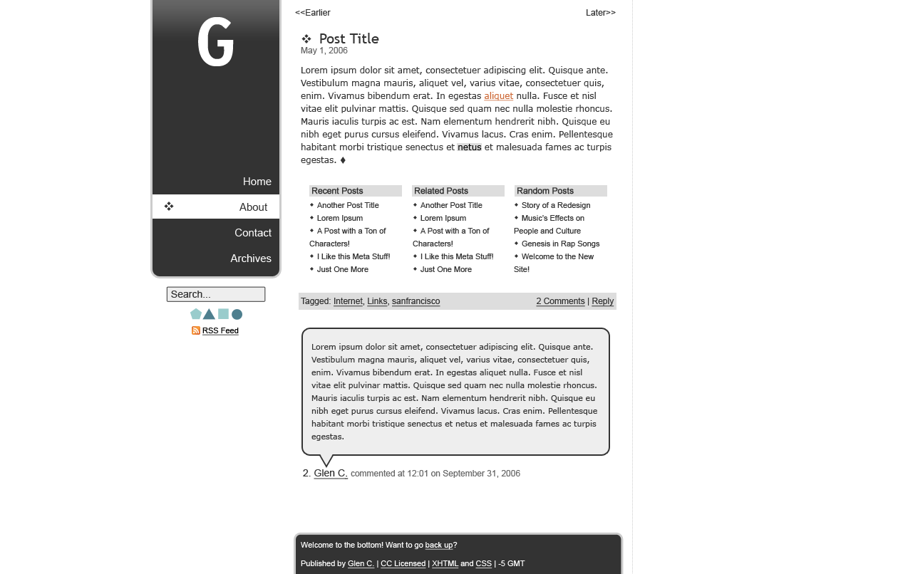
Floating Sidebar
The first and most obvious element in the whole design is the sidebar, specifically the fixed sidebar. (Staying in one place on the screen as the user scrolls up or down.)
My reasoning behind this was that all the information I planned to put in the sidebar was essential to the user experience so why not give it to the user at all times? No matter what the user might be doing on my page, he or she will always be able to use essential tools and find important information quickly. I have yet to see the results, but I bet my pageviews will increase drastically. Having essential information on-hand at all times is also good considering the rapid-fire nature of the internet.
I call the floating sidebar a 2.1 column design because while it technically is two columns, it offers a little more than a standard two-column design even though it provides a little less information. This solution is a lot more elegant than the monstrous sidebars I see on the default blogger templates. Having site-wide relative content in the sidebar ensures that the user will be able to navigate from any possible page and that the user experience will always be the same. While contextual data is important, it can confuse a user or potential reader. Though we scoff at the idea of not being able to navigate on a page and getting confused, I frequently see this with exact situation with my parents and even I am confused at times with certain changes a website undergoes from page to page.
In the sidebar, but given a less prominent position, is the RSS Feed. This seemed like a very strategic place for it because it means, at any time, that a user has the ability to subscribe to my site if they know how. Having a lot of visitors to a site is nice and all, but having a solid and devoted reader base is much more important to me. I made it so that it is as easy as possible to subscribe, so if the reader is so inclined, he or she can do it with a click or two.
The search box is also given a less prominent position under the "banner," yet it still sticks out visually and allows the reader to search at any time. I know I often have ideas flying in and out of my head at break-neck speeds when viewing a page. Having a search function available means that the user (or I) can act on these ideas and explore your (or my) site more.
On a technical (but relevant) issue, the fixed sidebar created a bit of a problem which could easily fly under the radar. This issue is that when the window is resized vertically, this can actually hide content from fixed elements because they overflow, but there is no way of viewing the content. Originally, I pictured the sidebar much longer than it currently is. If I had it this way, none of the information below the banner would be visible in 800×600-sized browsers. That's rather critical information to be left out. (Update: Jon Hicks figured out a way of handling this elegantly.)
If you're viewing this site with IE6 or less and don't see the sidebar floating and the banner a little messed up, I suggest getting a capable browser that follows the CSS specification more closely.
Reader exploration
Reader exploration, as stated before, is the most important thing on a blog or news site. People might come in from Digg or del.icio.us/popular or what-have-you and read one post. Chances are they are viewing your website with no sense of context. They don't know who you are, they don't know what other things you've written, and they probably won't actively seek out this information. That's why it's your job to give the reader some context via an introduction or something of that nature.
For this site, I put an introduction on each post and the homepage to help readers learn a little more about me and my site so even if they skip the homepage they'll still have some context to go with the post. Not only do I say a little about me, but I place a few keywords that will not only help with search engine ranking, but also give the reader a good place to start reading if they are interested in any of the topics. Finally, I have a link to what I think are my best/most popular posts. This is the easiest way to introduce a reader to your website and help them explore a little bit and is absolutely essential for blogs. There will always be some cruft entries on any given website, which is why archives are so inefficient. But when your best content is displayed in a key position, it will receive much more exposure and give the reader a good starting point from which to explore and get to know you.
Darren Rowse does an immensely good job of this. He placed a series of links to posts (with keywords) at the top of the page in an obvious place to suck the reader in, which is really the point of any blog. He displays targeted entry points in a strategic position with enough variety to appeal to most of his site's visitors, the problogging type. Darren has a lot of really great content, but awesome content is useless when the reader has no way to find it.
Another aspect that Problogger handles extremely well in regards to reader exploration and information architecture is the Related Posts section at the end of each post. He even wrote a post about this where he said that having this section increased his pageviews and ad revenue all within 3-4 days of installing the related posts plugin for Wordpress.
I know I've gotten sucked into his site before, seeing a catchy post title that deals with something I would like to hear about. At a few points, I even had 20 Problogger tabs open at one time. If that's not good Information Architecture, I don't know what is.
So as any great artist would do, I stole the idea and used it on my own site in addition to recent and random posts, thinking that at least one of these sections could have a post title that would catch the reader's interest. For reader exploration, there is nothing better than to let the reader know about other posts on your site after he or she has finished reading the current post.
Finally, I decided to not go with a fancy footer because I had most of the information a user could want displayed towards the top of the page or floating alongside the content. I still support the idea, though.
So ends Day 3. I've learned a lot about Information Architecture and I hope you will think about it more now, as well.